
Orientation Events App
UX/UI DESIGN
The Prompt
Design an experience for students to discover orientation events and craft a visual system to accommodate different types of events: sports, music, visual arts, social groups, and volunteering events.
Research
Secondary ResearcH
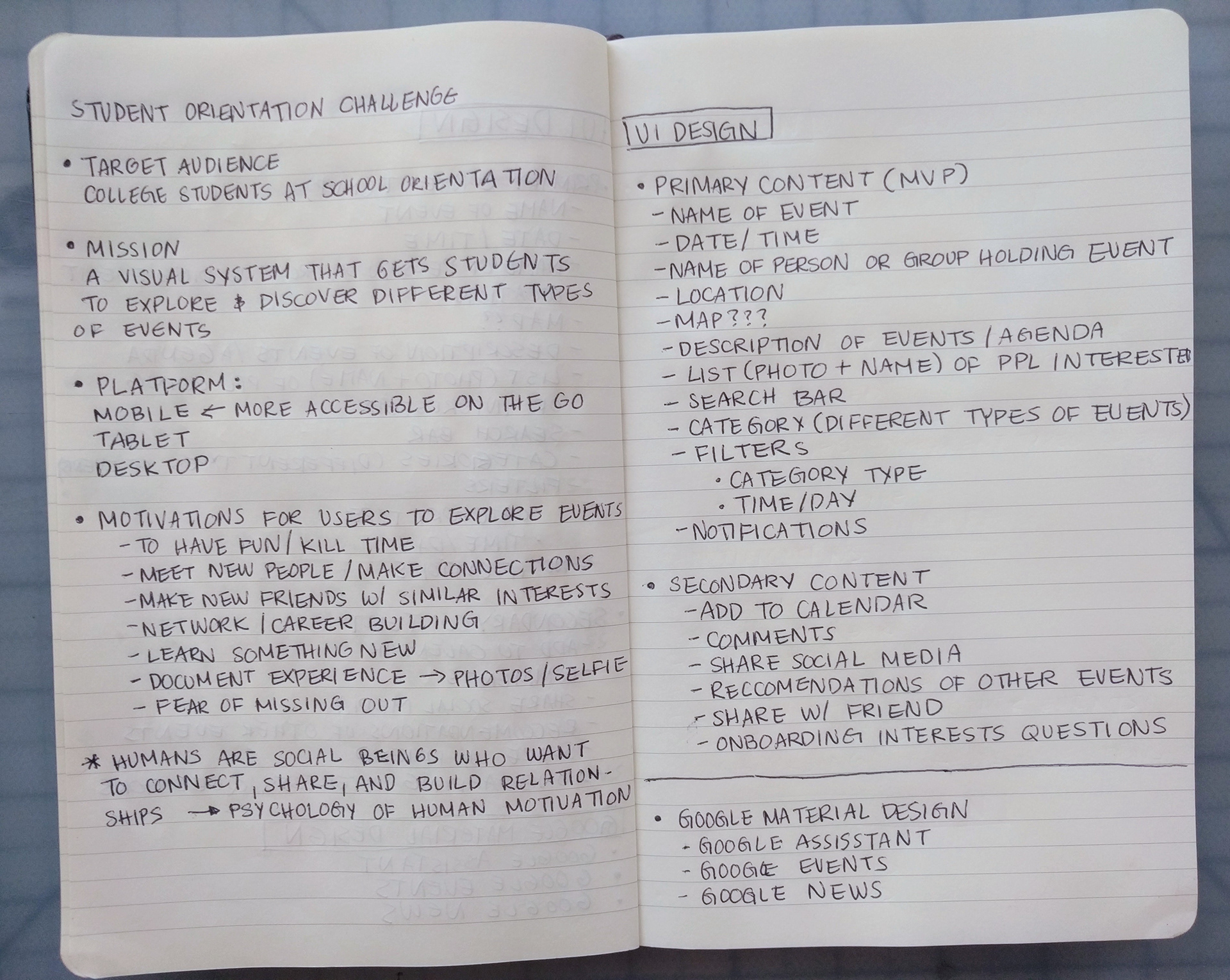
In this Design Challenge, I started by writing out the who, what, where, when, and why of this project. I decided that the target audience were college students attending a school orientation. I made the assumption that a mobile app would be more accessible for students while they are moving around during orientation since most students carry their cellphones with them everywhere.
the importance of social connection
Understanding the goals and motivations of students at the orientation can tell us the type of information that they seek when deciding to attend an event. In my online secondary research I found that many of the motivations for users to attend an event involve making social connections, such as:
> Networking/ Career building
> Meet new people with similar interests
> Make connections
> Document experiences with photos
> Learn something new
Then I conducted competitor research on some of the most popular online event management platforms and listed out content and features that I felt would help the user's experience in finding an event.
PRIMARY Research
To better understand what factors are important to users when they are looking for events I interviewed Julia, a college student who frequently attends campus events.

time/ Date of event is A limiting factor for event attendance
The first thing that Julia looks at when browsing events is whether or not the time and day of the event works with her schedule for school. Julia is open to attending events that are outside her interests. However she cannot attend an event if the time and day conflicts with her schedule.
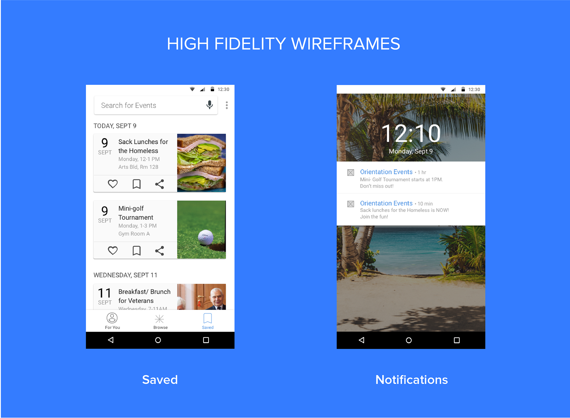
notifications are good reminders for users with a busy schedule
Due to Julia's busy schedule, it is hard for her to keep track of events happening on campus. Julia subscribes to text message notifications from different organizations that text her reminders of events that are coming up.
Design Process
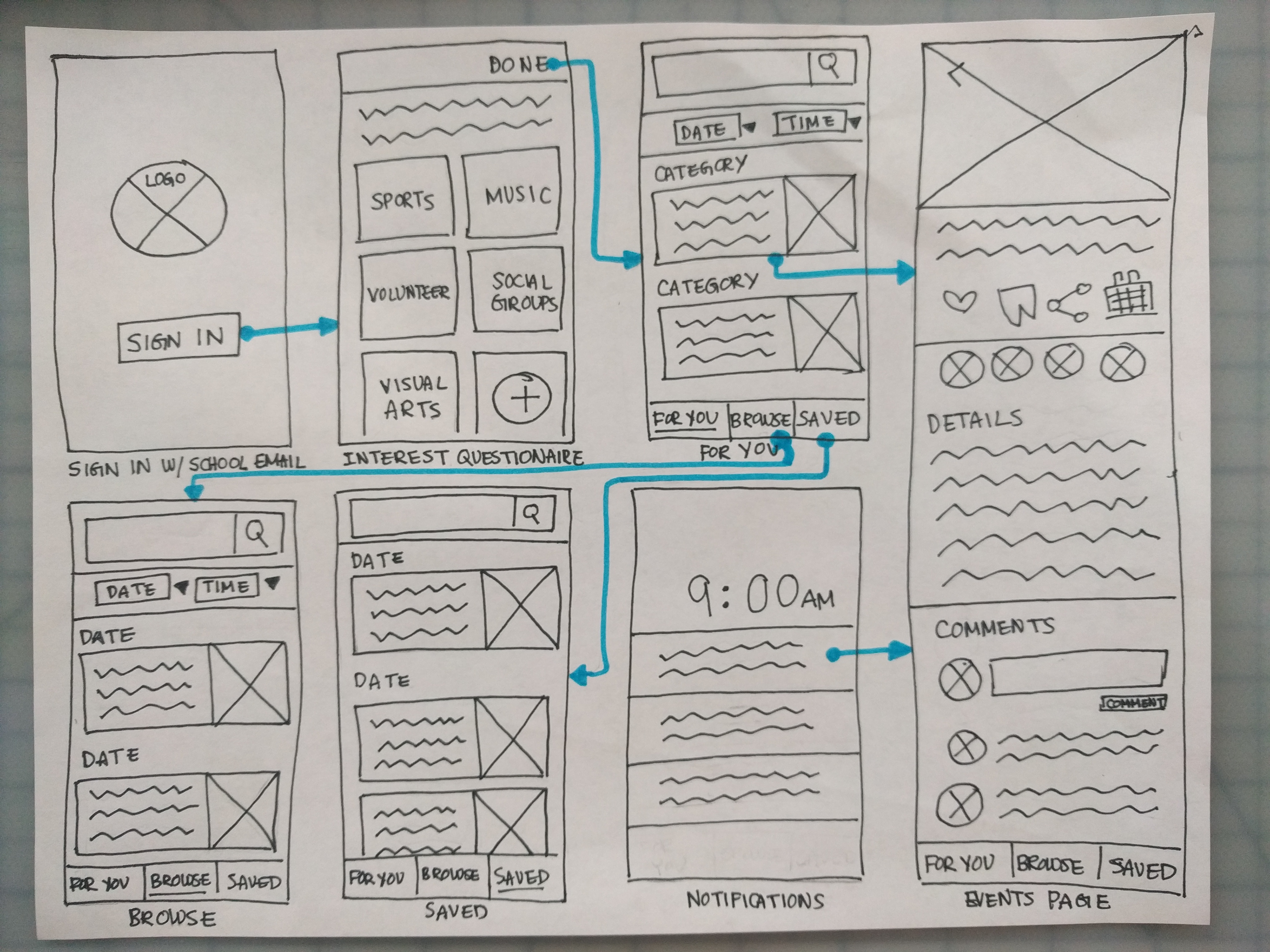
user flow
Using the insights discovered during the research phase, I sketched out the user flow of a first time user.
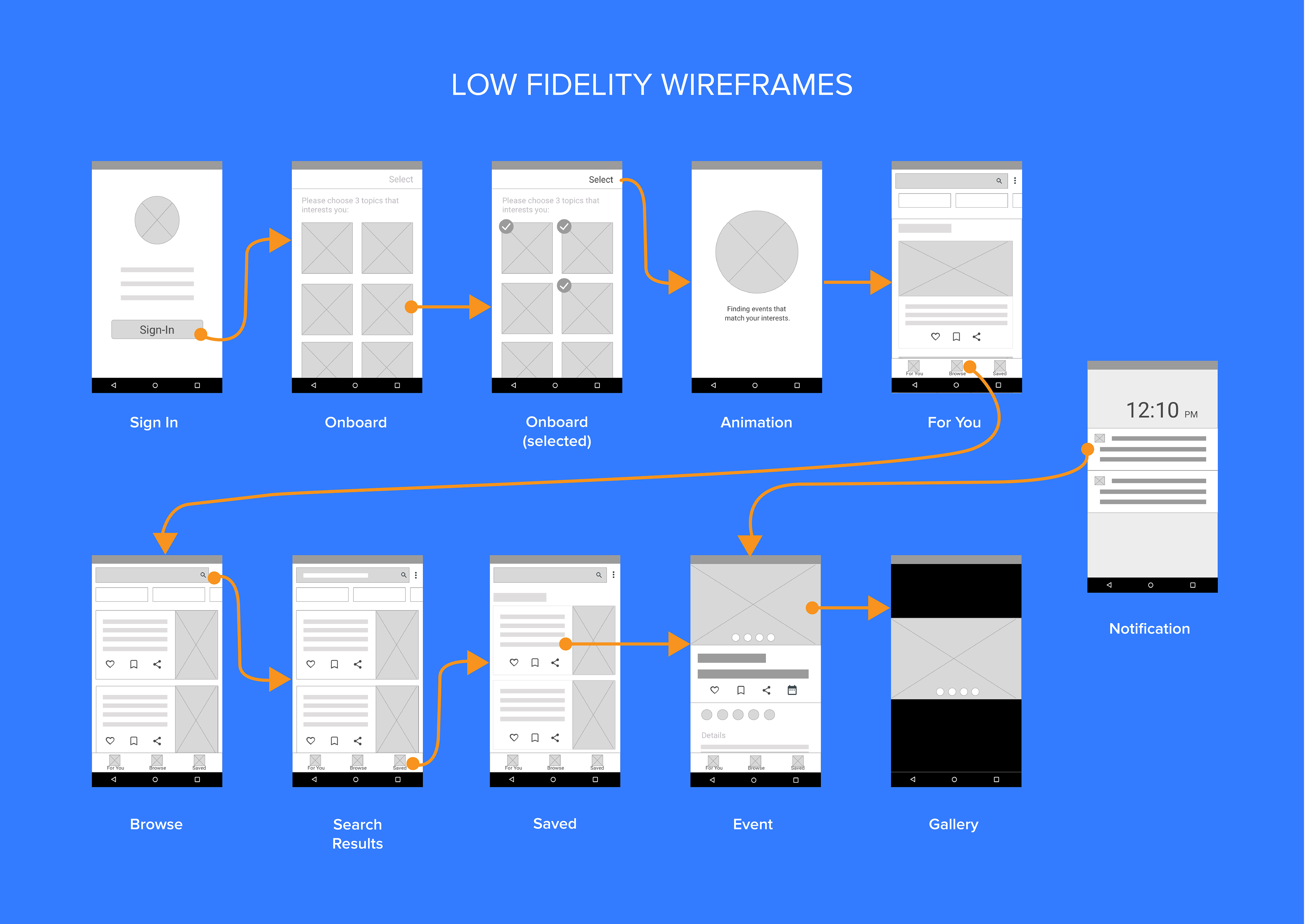
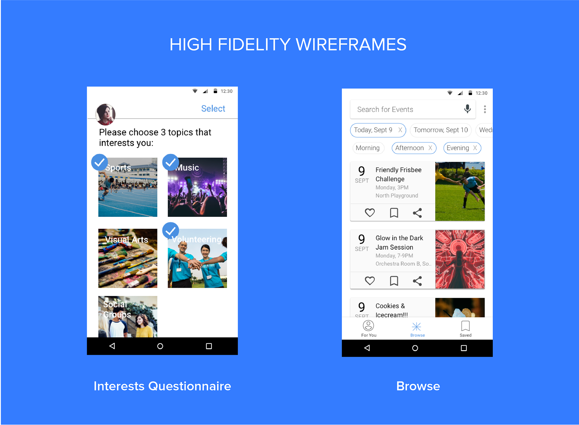
DIGITAL WIREFRAMES
Then I digitized the wireframes and added a gallery screen and a loading screen.
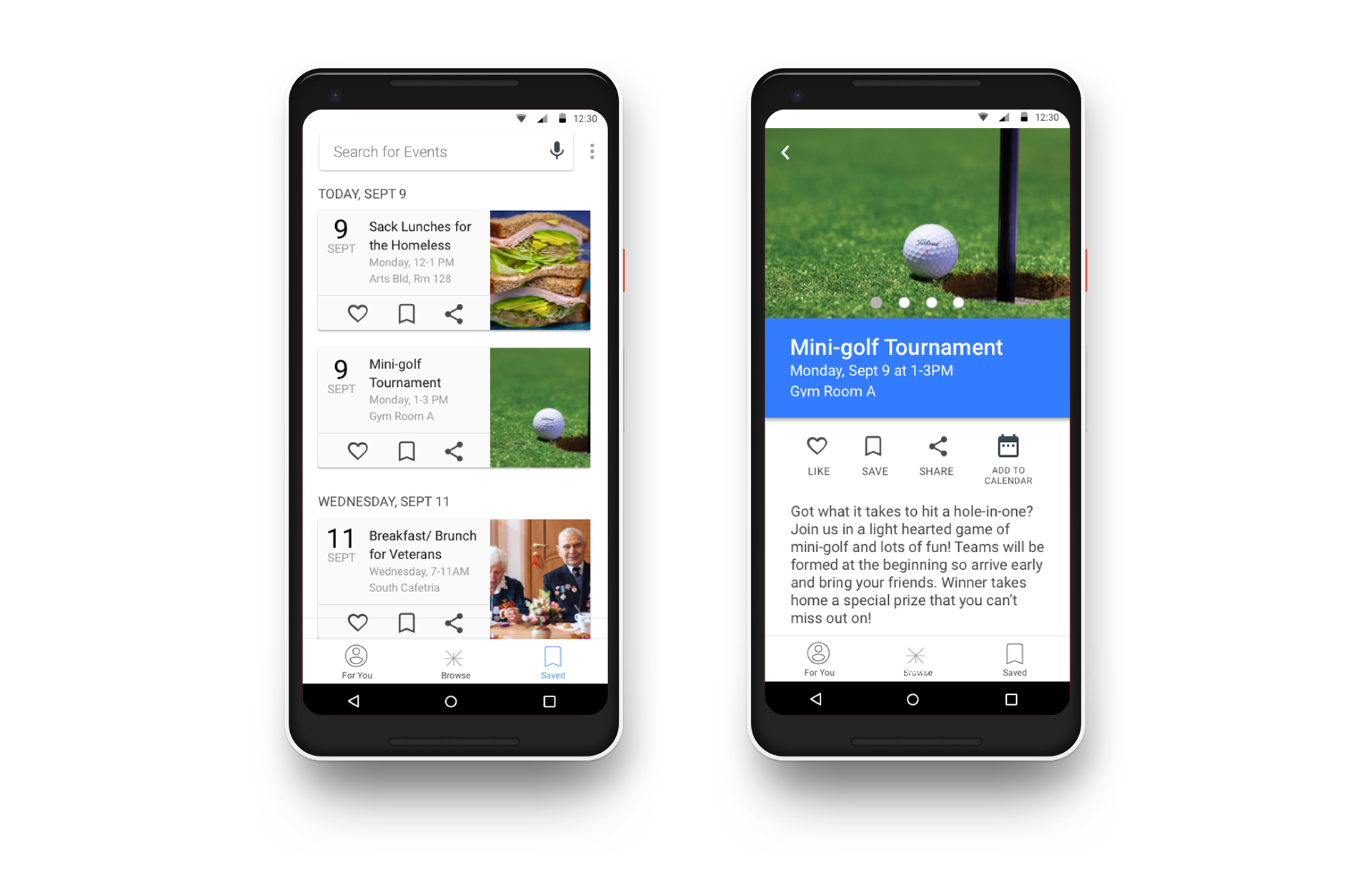
> Photos of people enjoying the event entices users on the app to want to attend the event.
> A loading microinteraction tells the user that the app is processing their selections and is personalizing the app for the user. Providing feedback to user's actions in the form of small microinteractions such as an animation or a check make improves users' experience when going through the app.
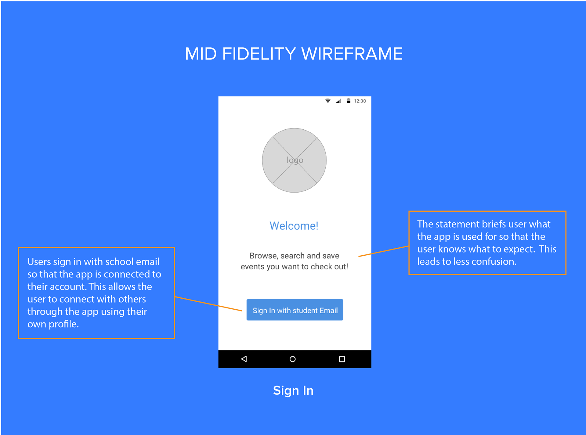
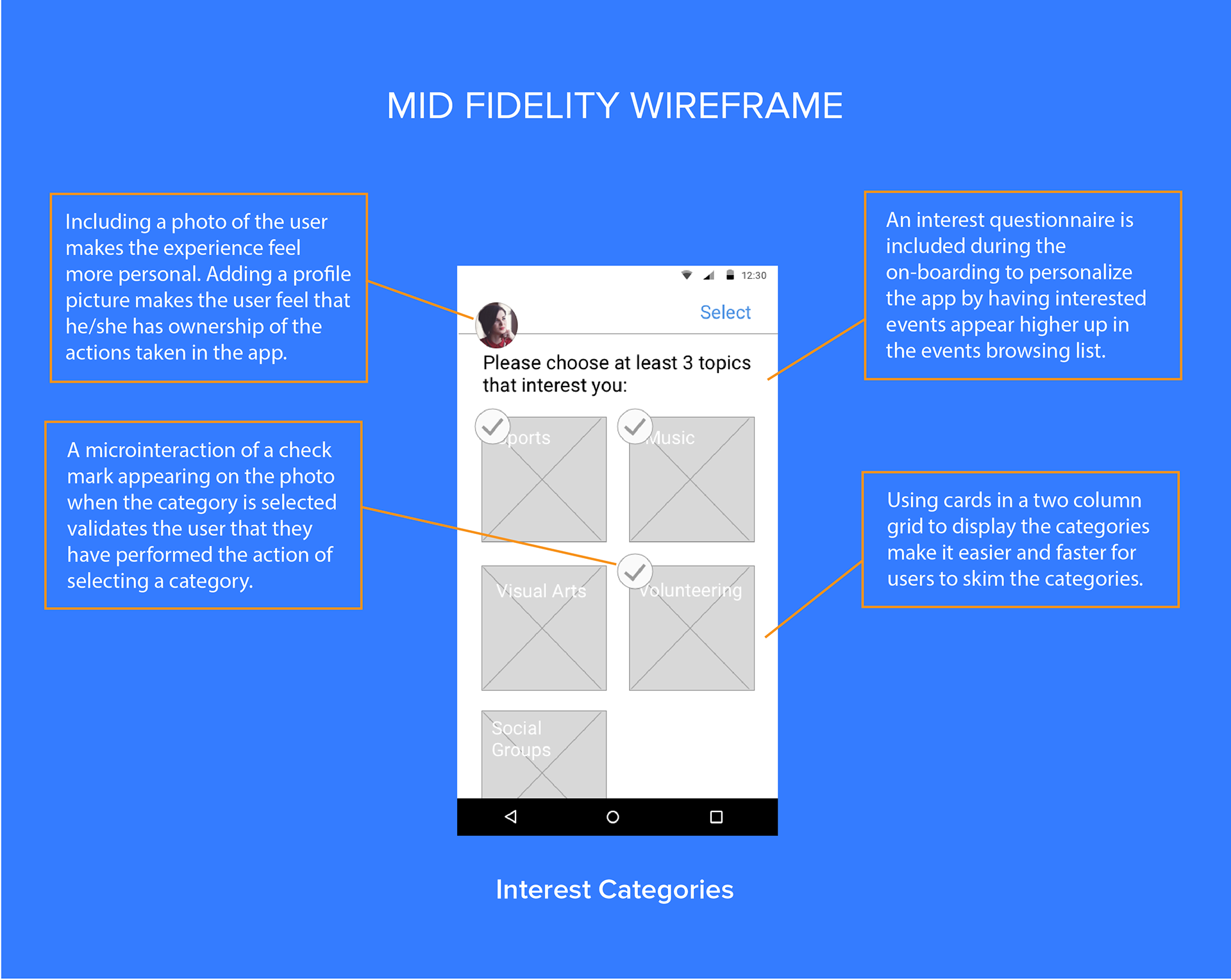
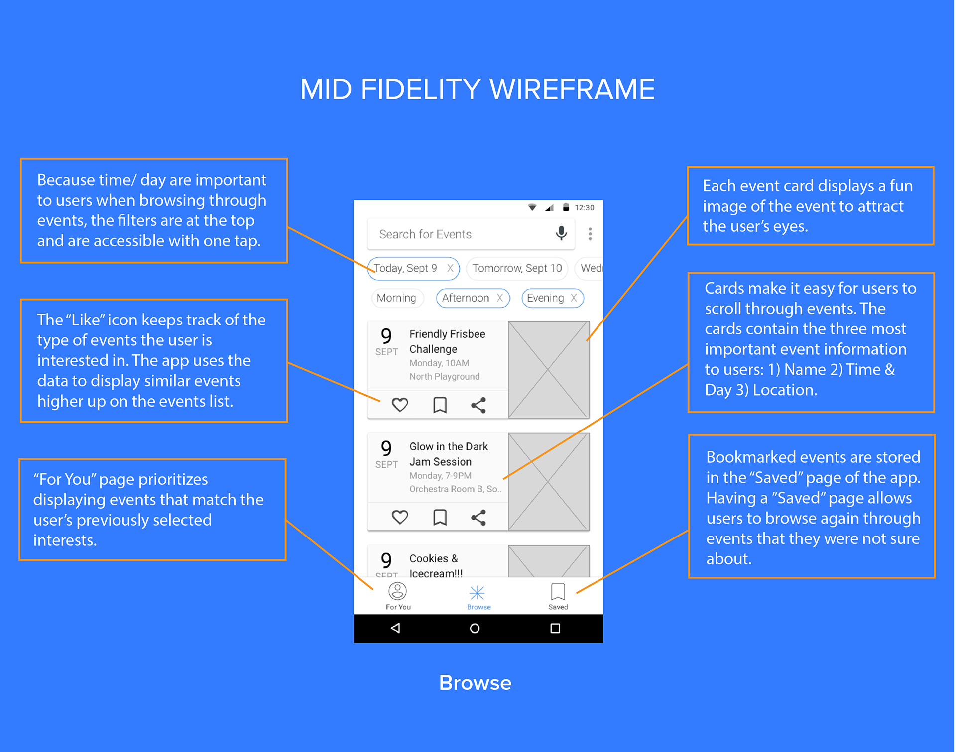
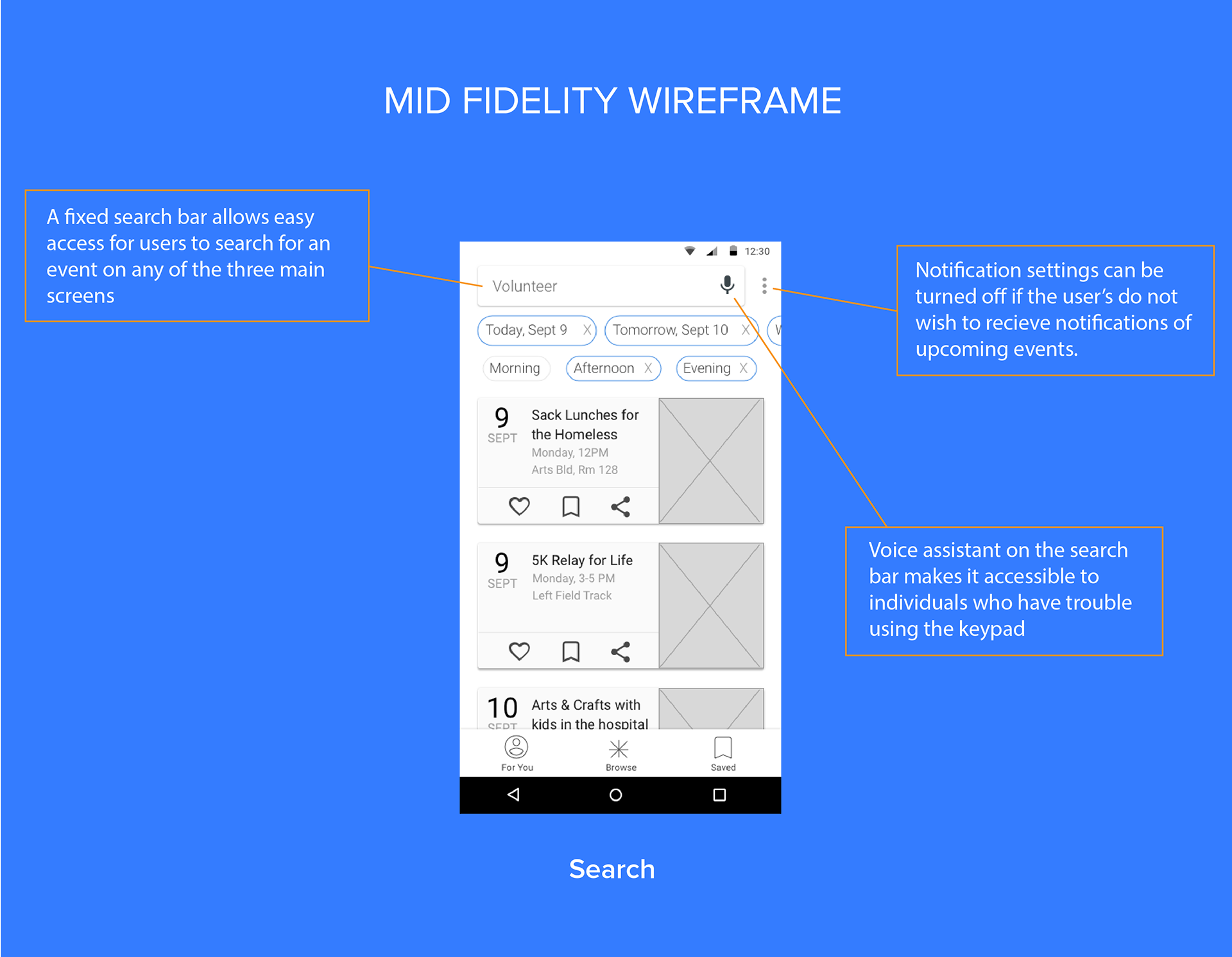
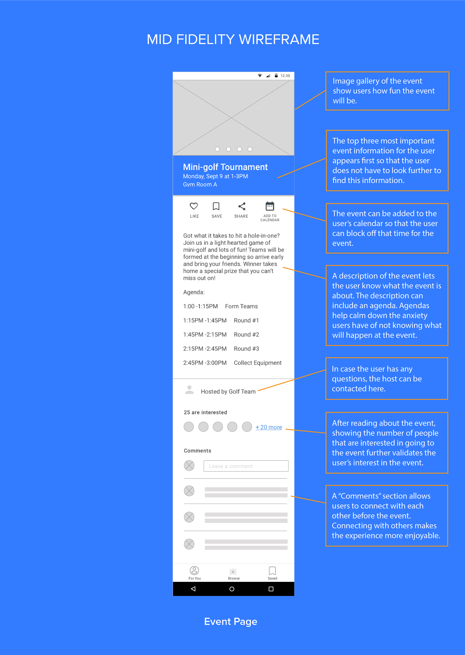
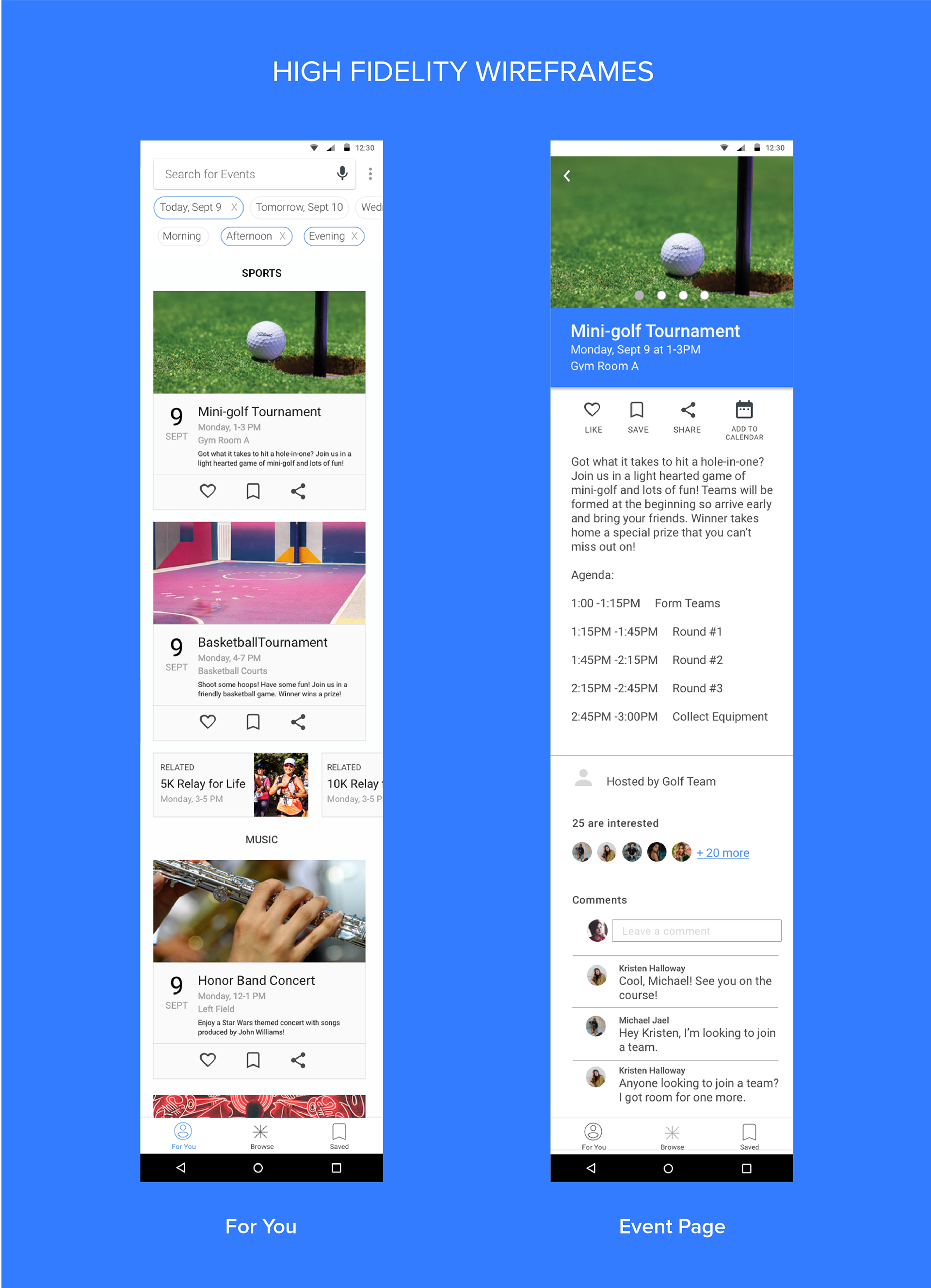
UX design principles were applied to the placement and order of content and elements on each screen. Decisions were made based on users' needs of using the orientation events app.
Following, I go into detail on design decisions made on five of the most important screens in the app's user flow.
Next Steps
The screens will need to go through a couple rounds of user testing with college students in order to get their feedback regarding the app's usability and flow. Several rounds of user testing will need to be completed before the UI of the app is finalized.
Feel free to reach out if you have any questions. Thanks for reading!