
AppleOne Job Application Form
WEB REDESIGN
BACKGROUND
PROJECT DESCRIPTION
AppleOne challenged me to redesign the online job application to increase lead conversions. A content audit was conducted on the current online application and a redesign proposal was created applying good UX principles through testing. The redesign proposal was presented to AppleOne executives and the marketing team.
PROJECT ROLE
As an individual project, I worked on the research, testing, and final deliverables.
RESEARCH
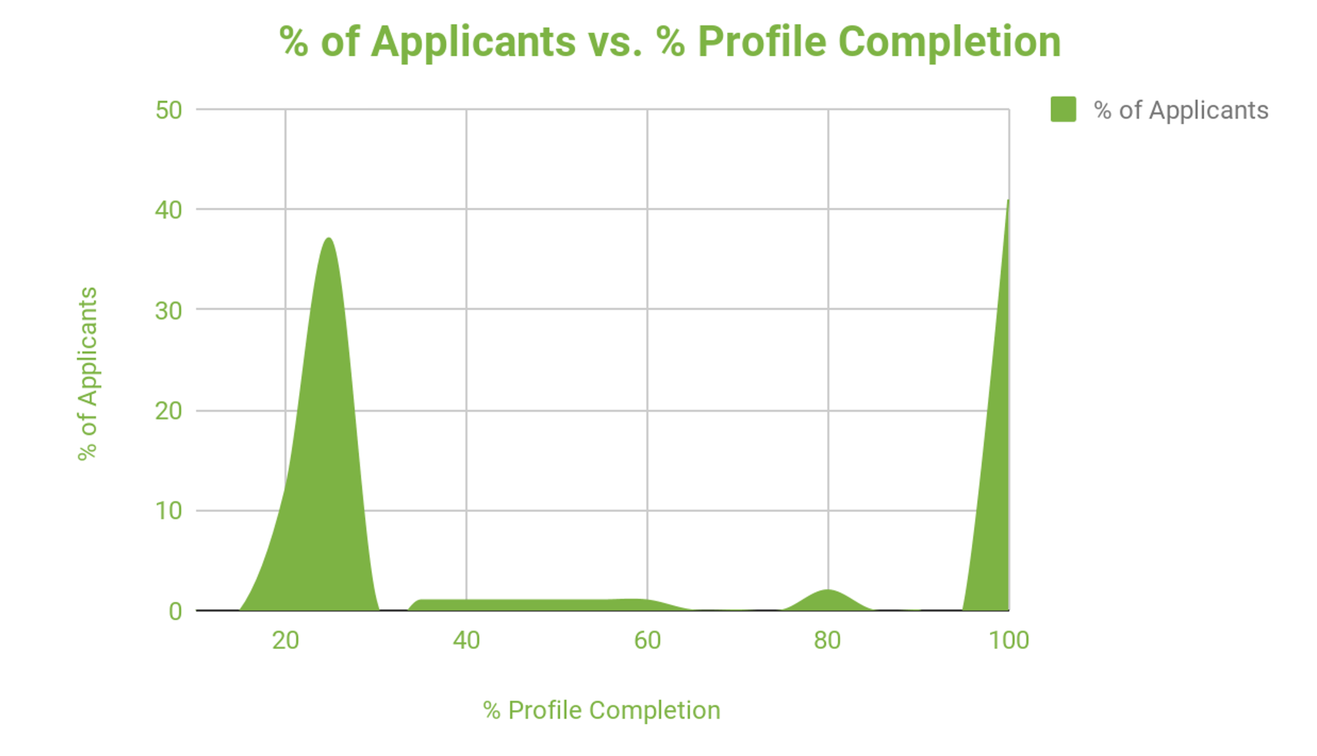
Web Data Analytics
Using Google Analytics, I looked at when in the profile completion process did users drop off. As the data below shows, many users dropped off 30% into the application or they completed the entire application. This led me to further dive deeper into the web pages and content in the first 30% of the application.
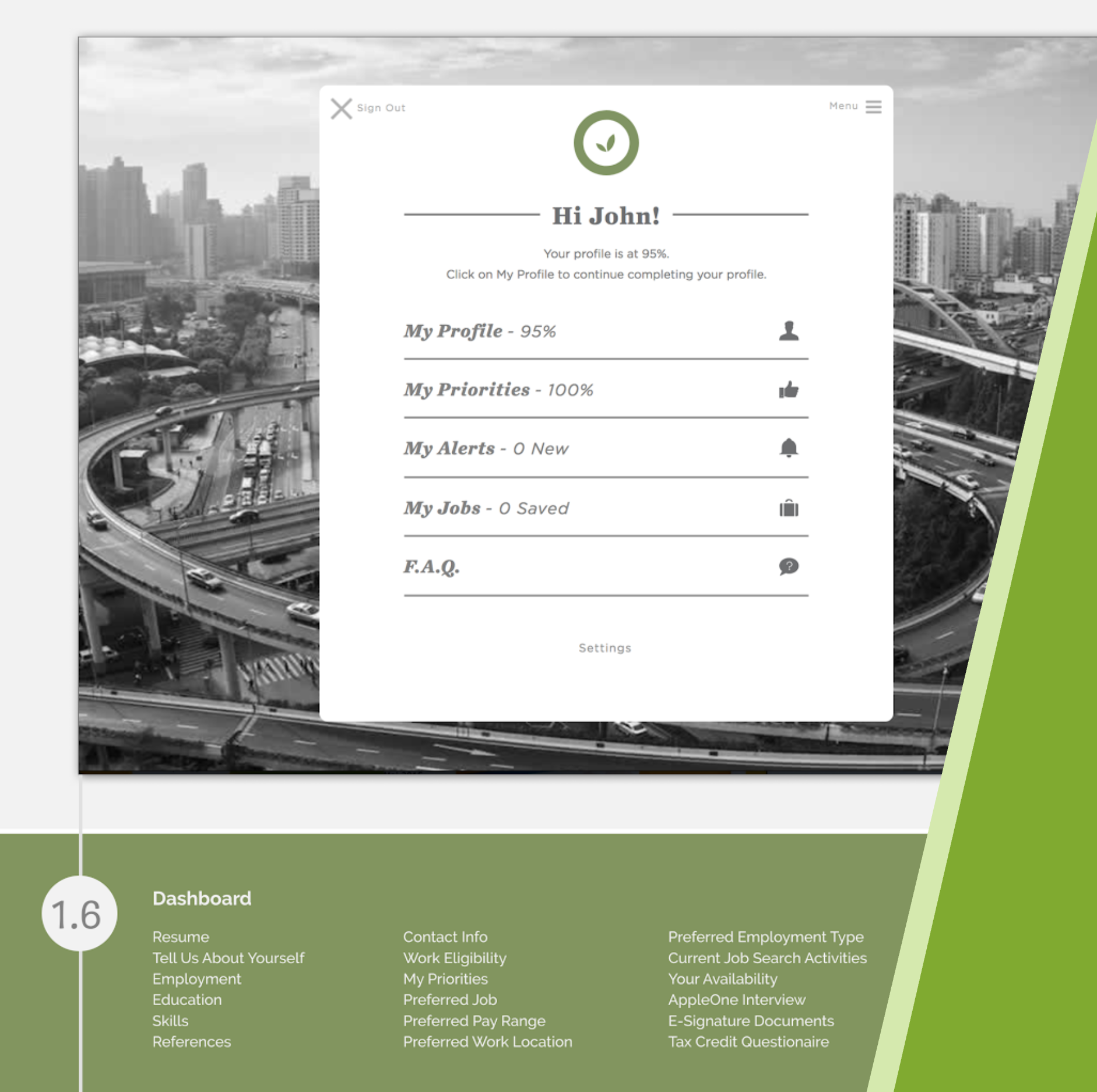
Content audit
Every form field item was logged in an excel spreadsheet to get a better idea of the type of information being collected during the first 30% of the application. What I found was that the first 30% of the application:
> Collected over 50 fields of information about applicant
> Collected private information about applicant
> The entire application can be divided into 5 types of information
> The first 30% consists of one of the five main sections- The My Profile Section
Expert Interview
An interview with a Talent Development Manager at AppleOne revealed more information on how the recruiting teams uses the application to match qualified candidates to their job listings. The interview revealed that the Talent team required all fields of the application filled out in order to have all the data they need to match the applicant to the best job. Having all of the application filled out also streamlines the employment referral process, such that the Talent Recruiter doesn’t have to go back and forth asking for the information.

DESIGN
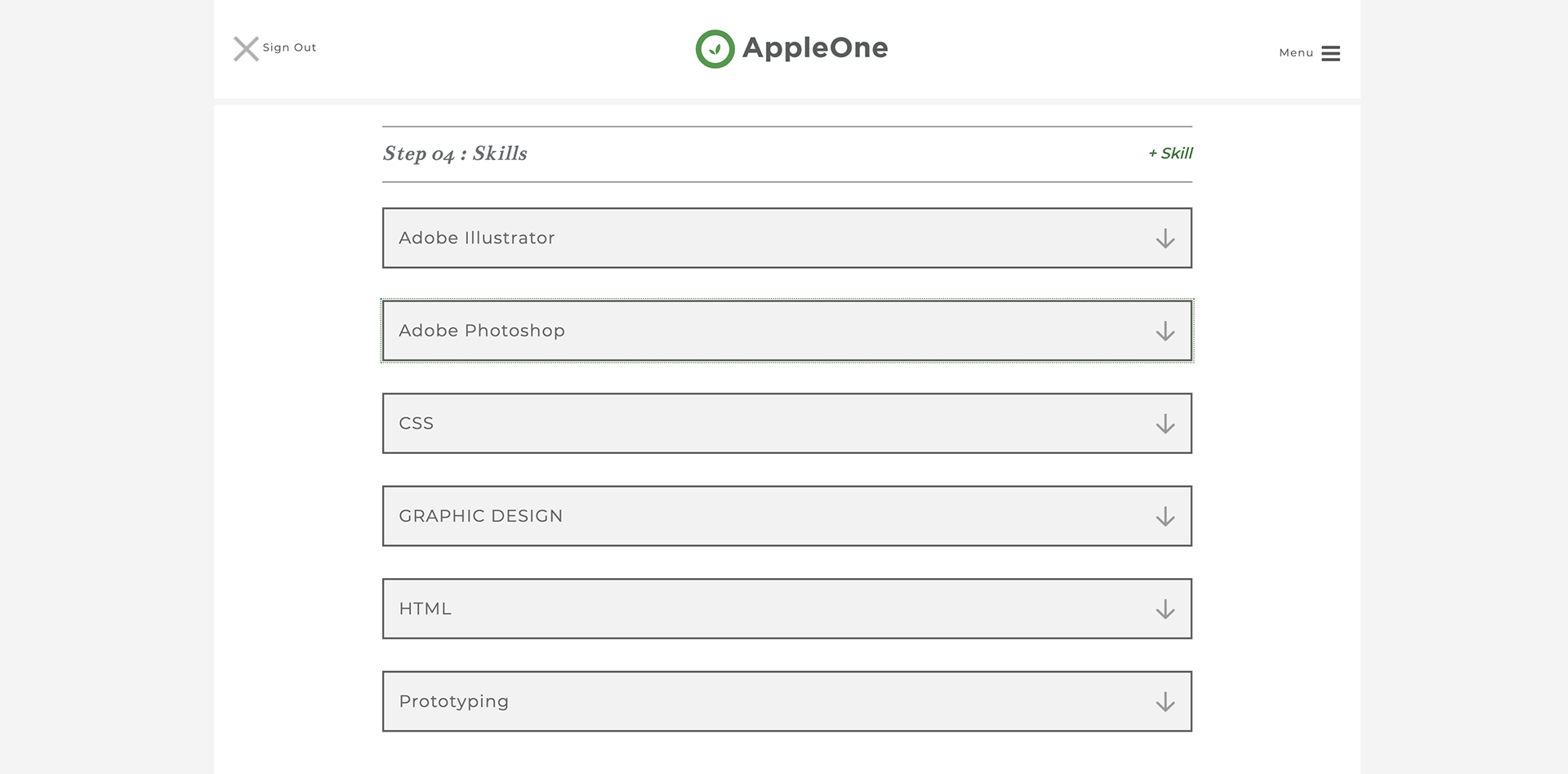
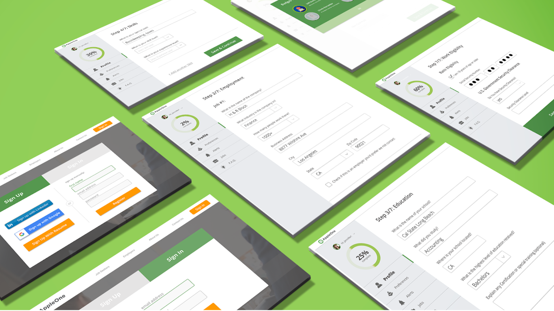
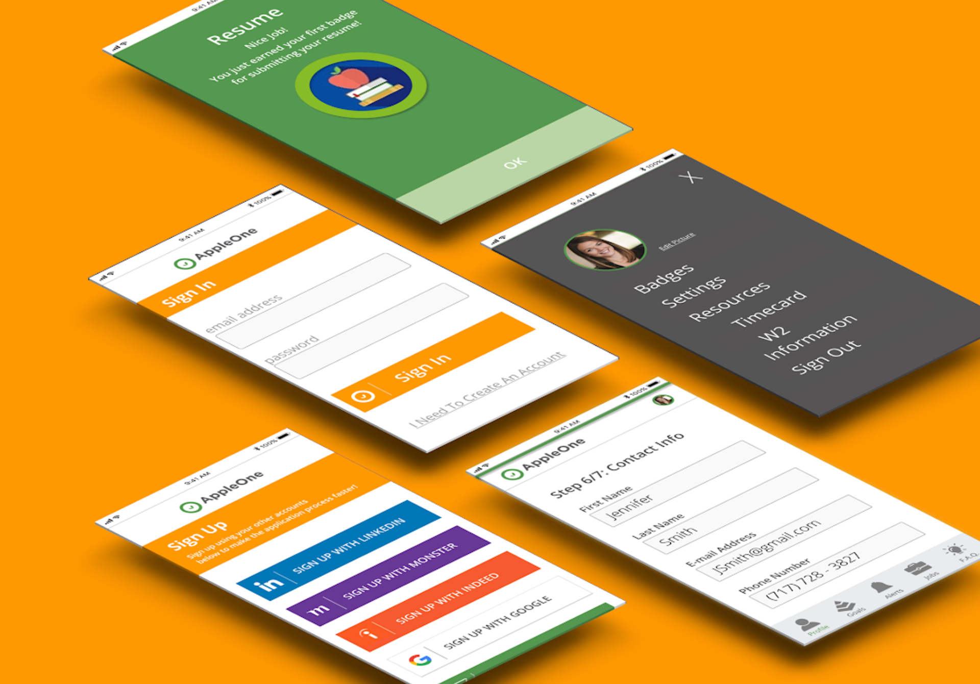
Prototyping
From the research gathered, I sketched out rough wireframes of the new frames for the application. Then I used Figma to digitized these wireframes into a mockup.
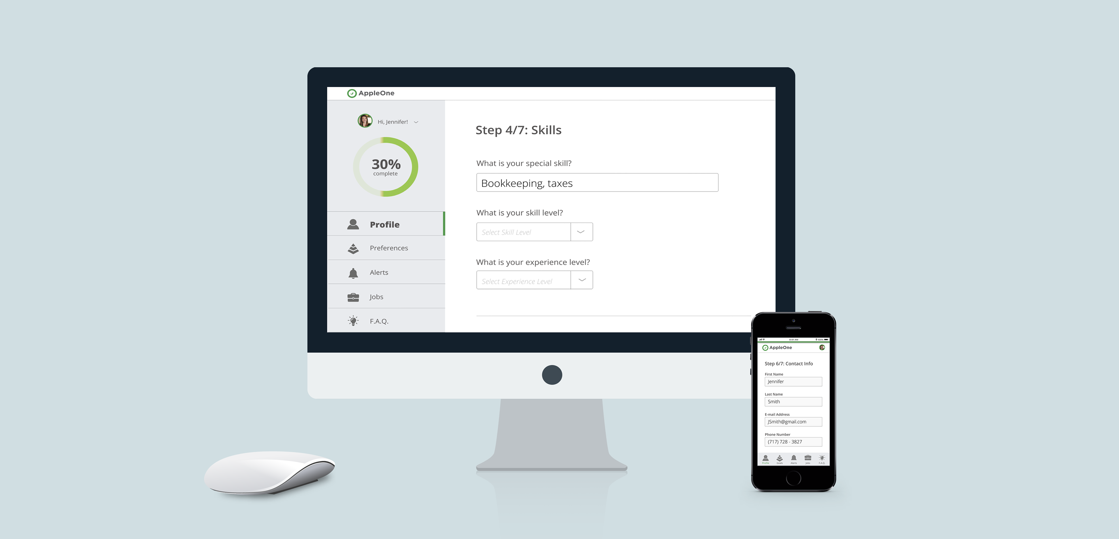
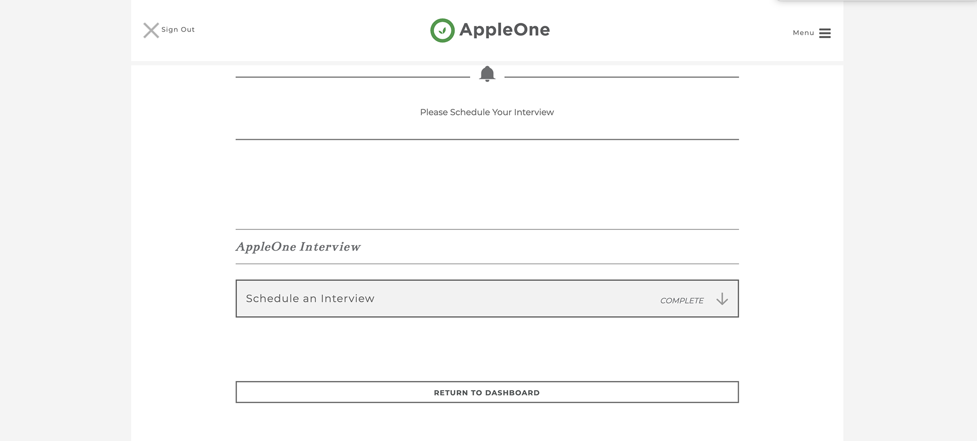
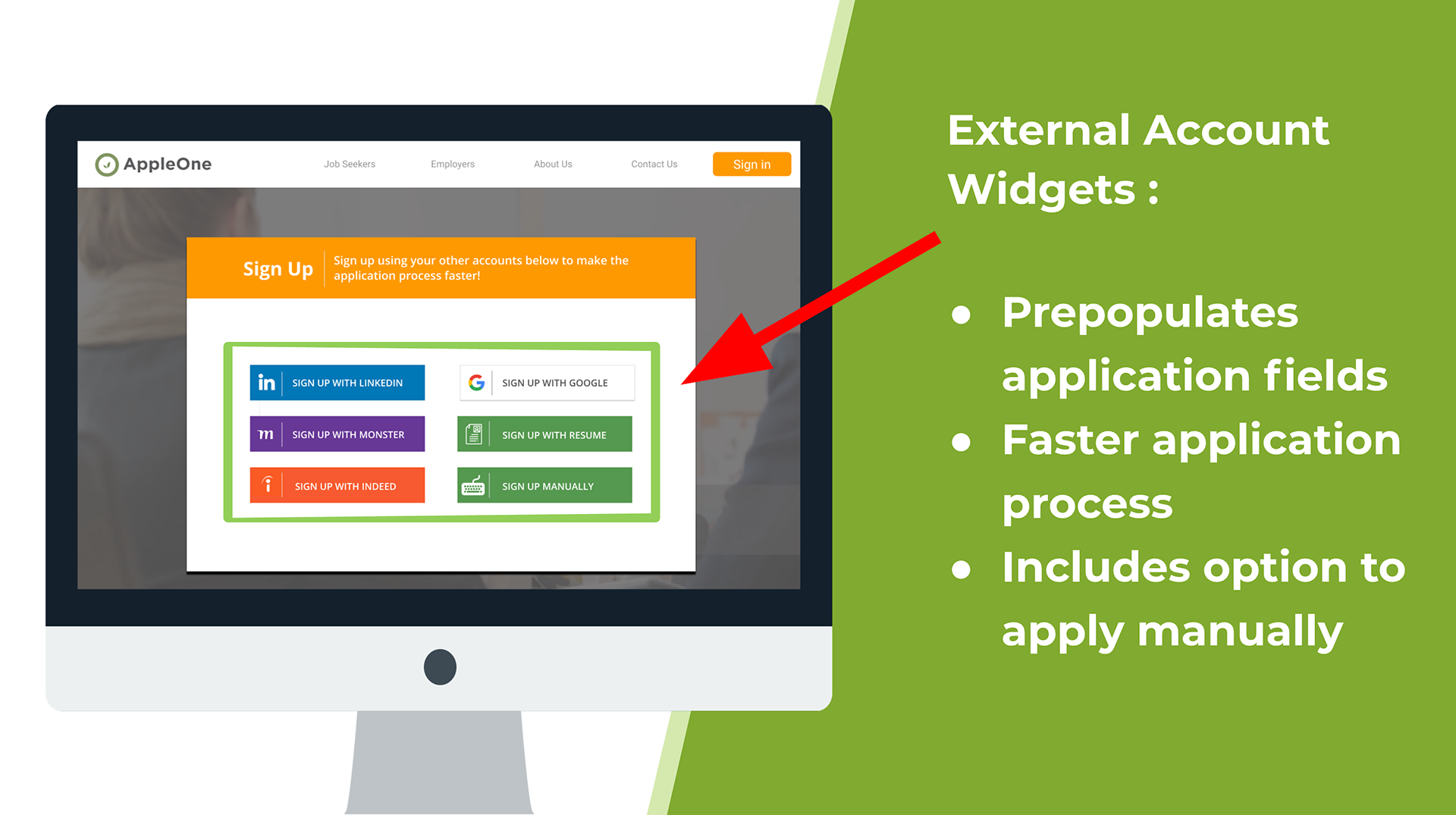
Design Proposal #1 - Adoption of Third Party Widgets to streamline Onboarding
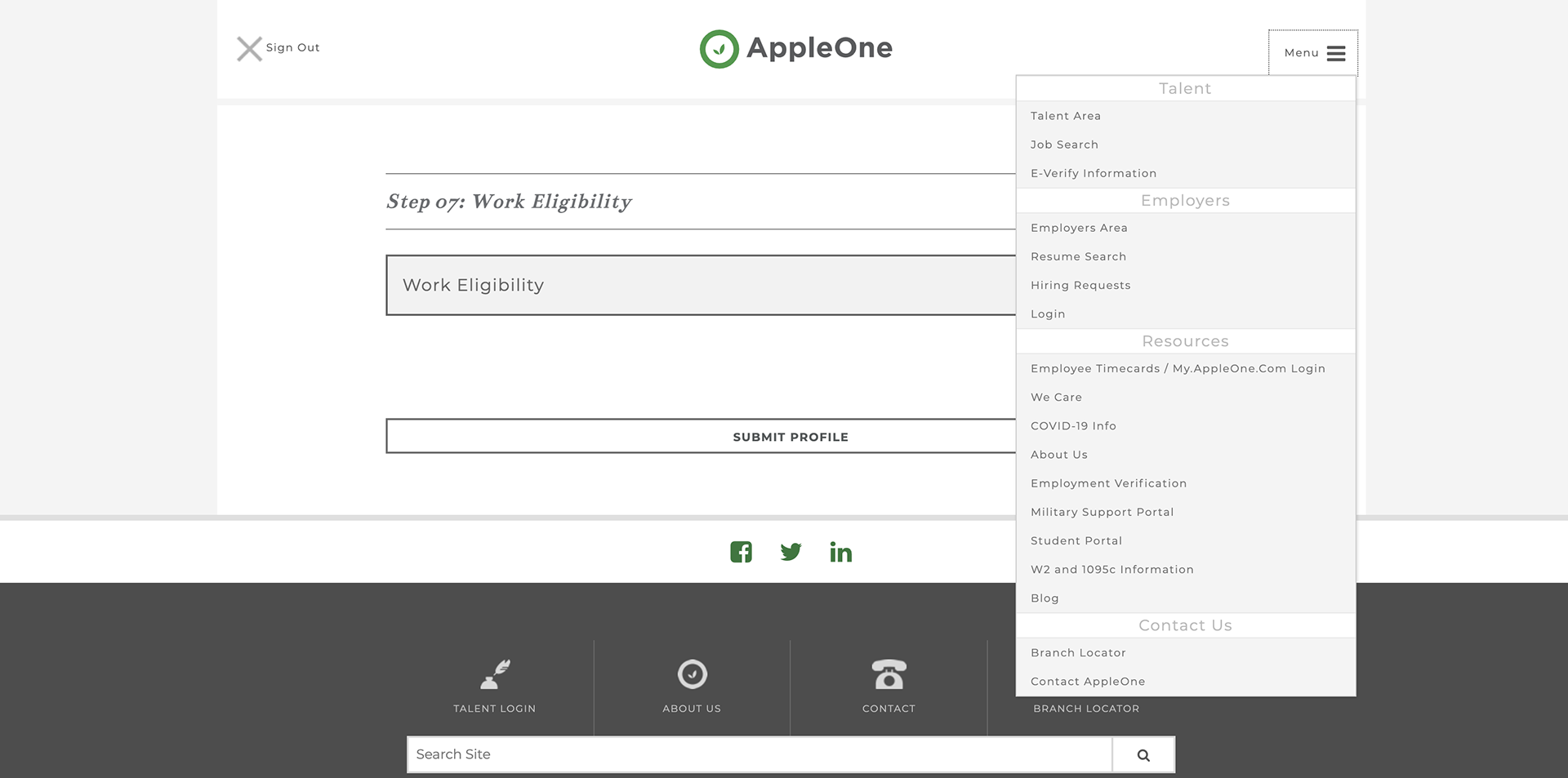
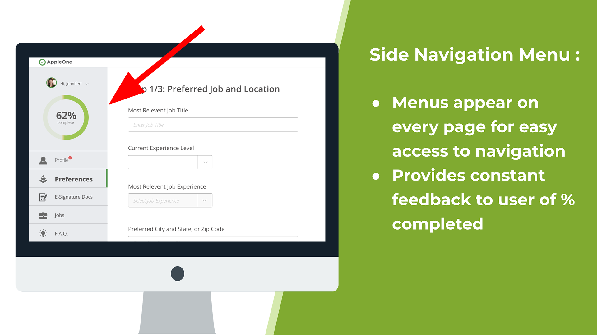
Design Proposal #2 - Side Navigation Menu for better accessibility
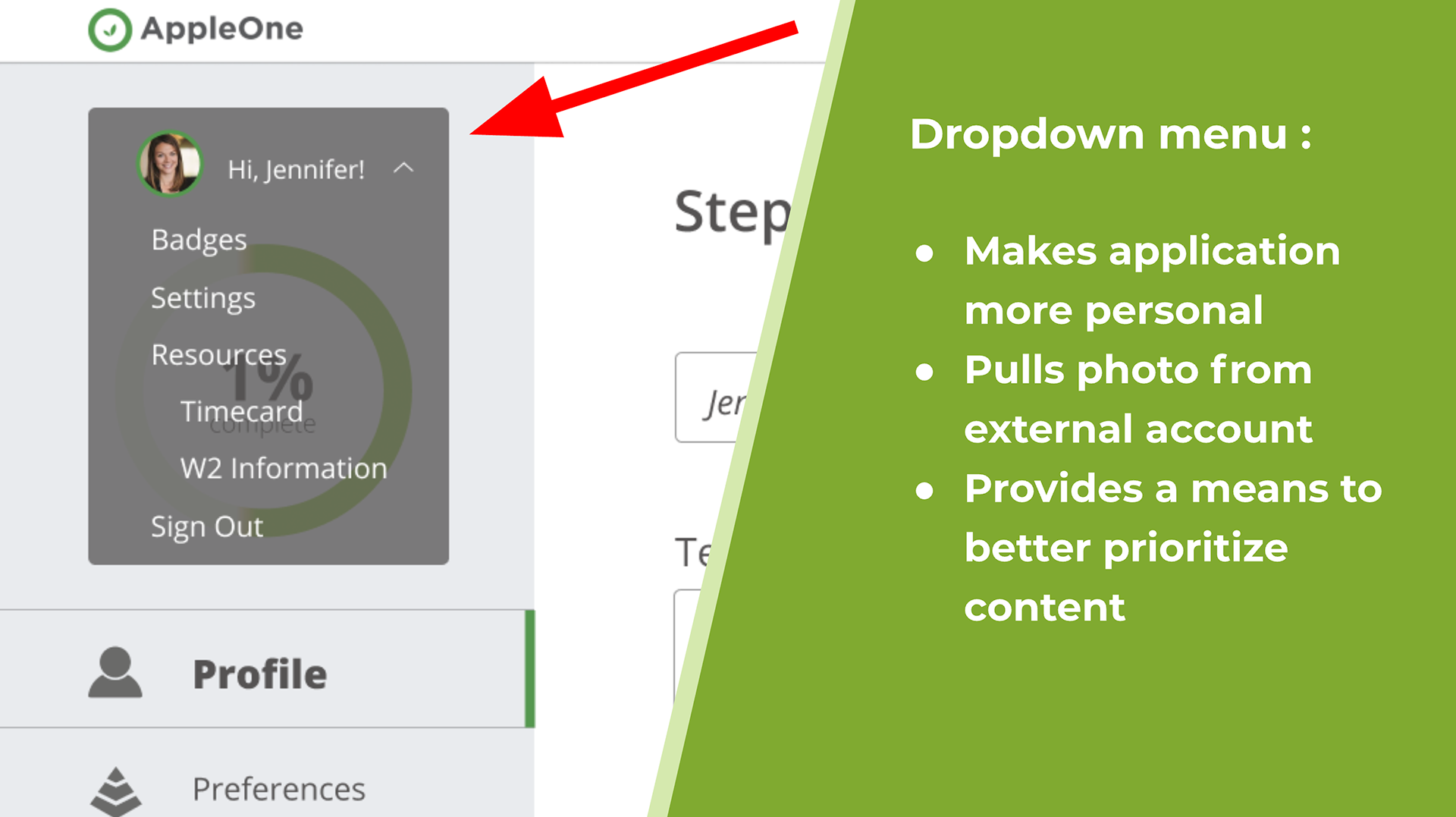
Design Proposal #3 - Drop Menu to consolidate content
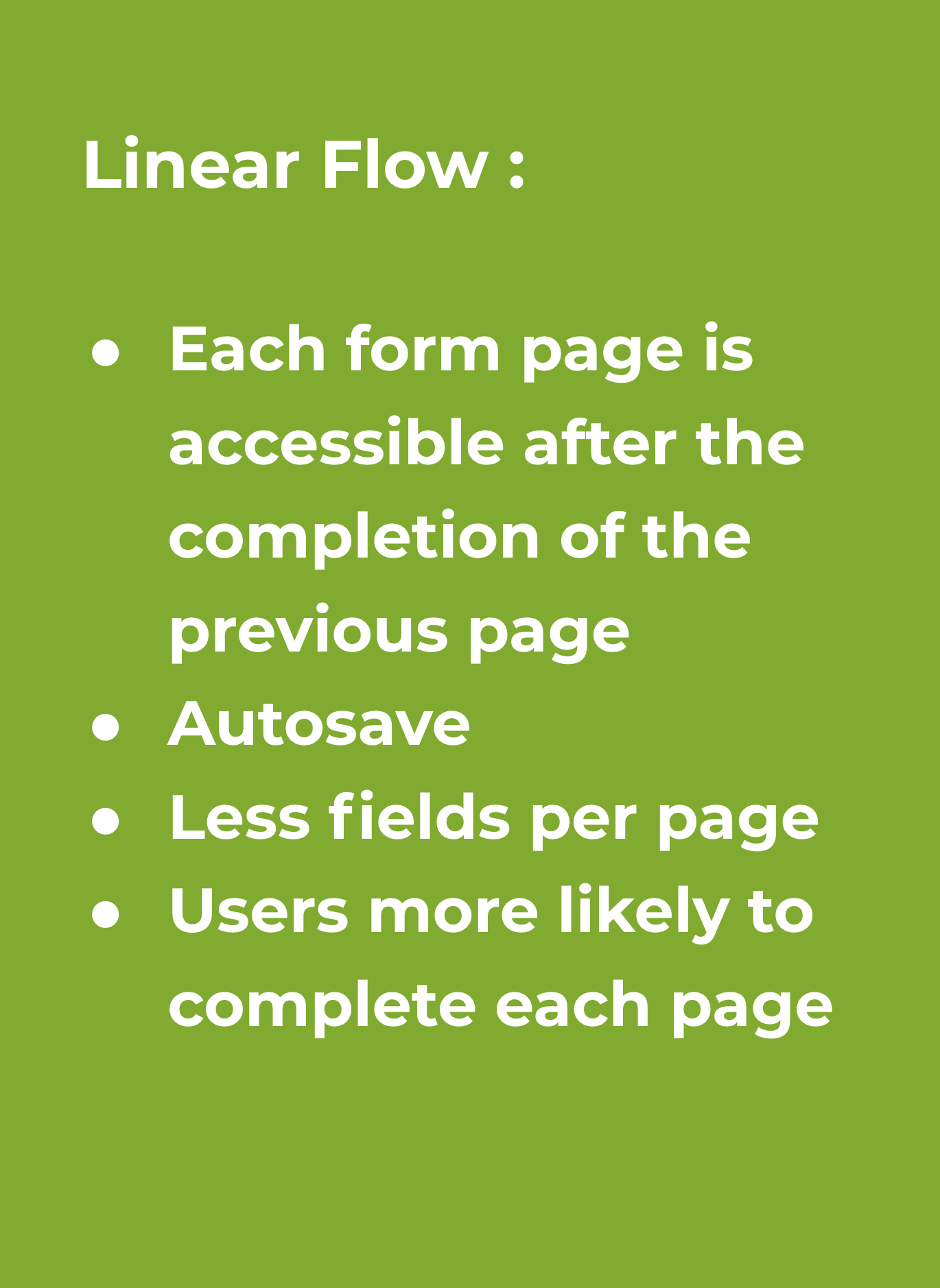
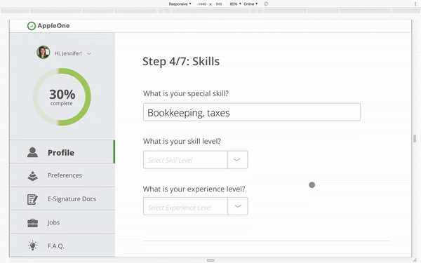
Design Proposal #4 - Linear flow to application form to increase lead conversion
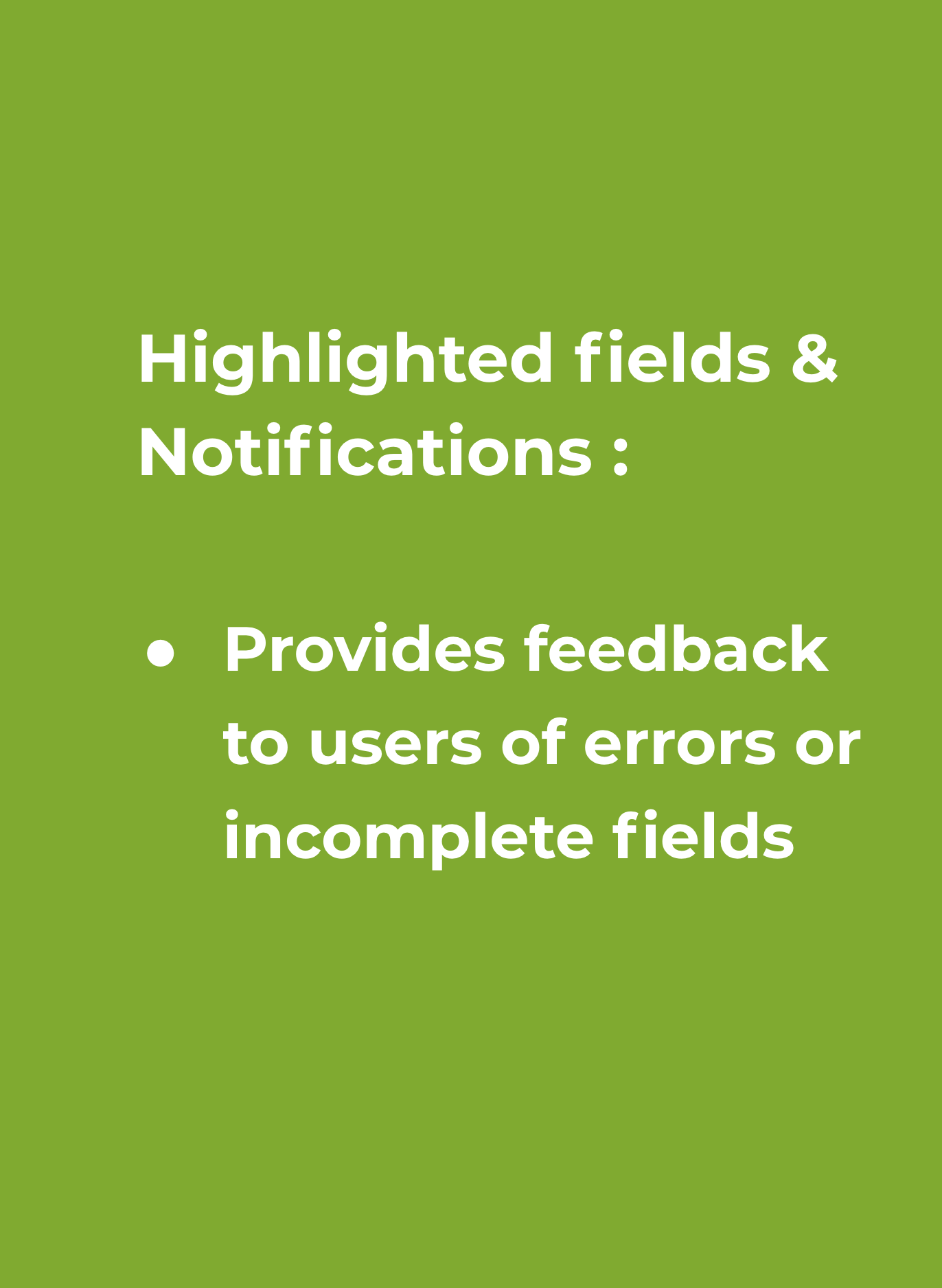
Design Proposal #5 - Highlighted Error fields to identify errors in missing data fields
User Testing
Two users were tested on 5 different tasks using the prototype. The users achieved 4 of the 5 tasks without any problems. Both users struggled in the Sign up portion of the application.
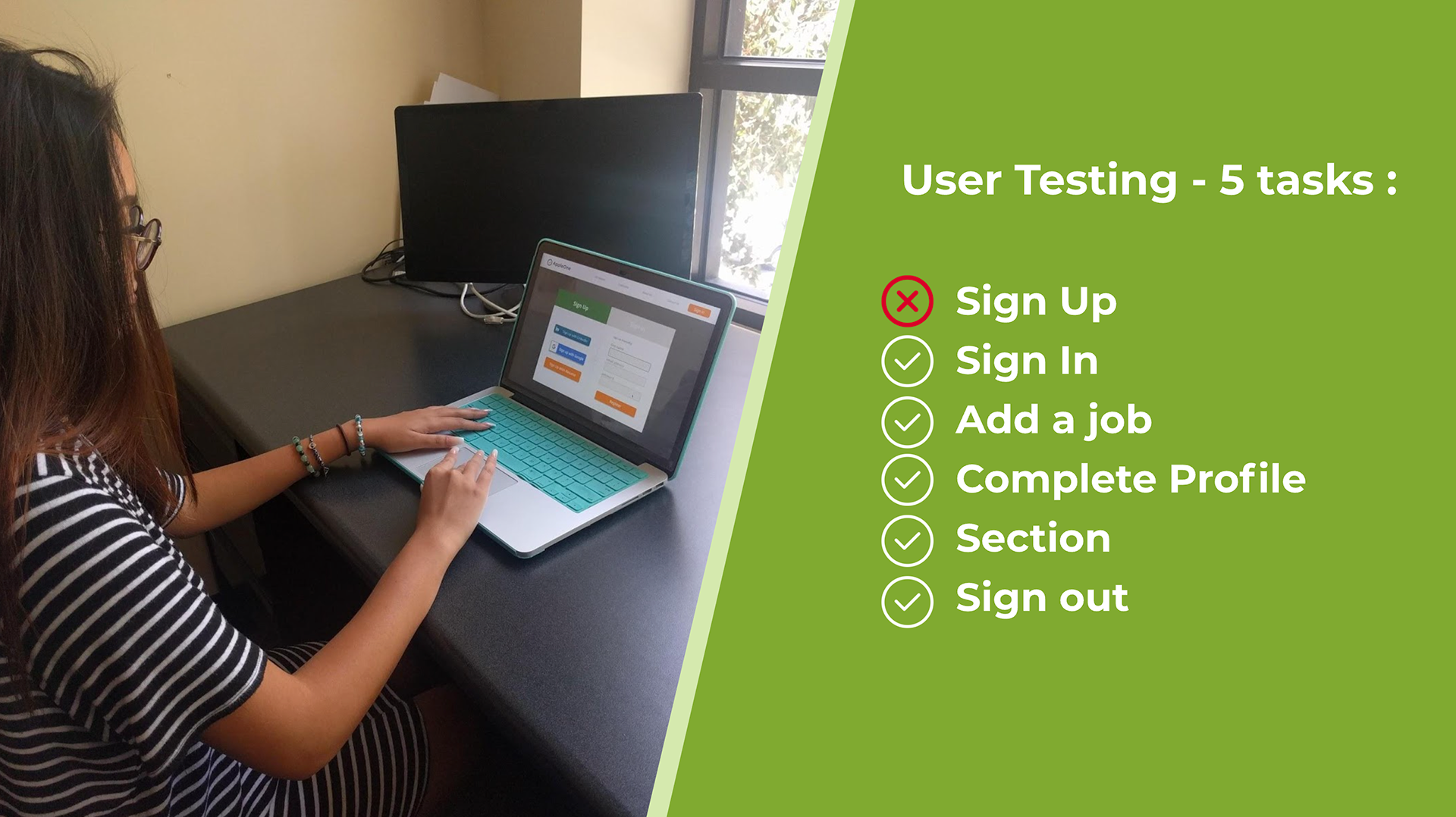
Both users did not see the “Sign In” button because it was greyed out. Both users clicked the “Sign In” button on the upper right to access the Sign-In screen.
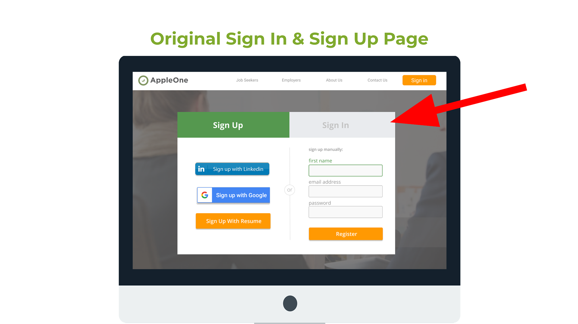
To remove the confusion between Signing up vs signing in, the two user flows were separated.
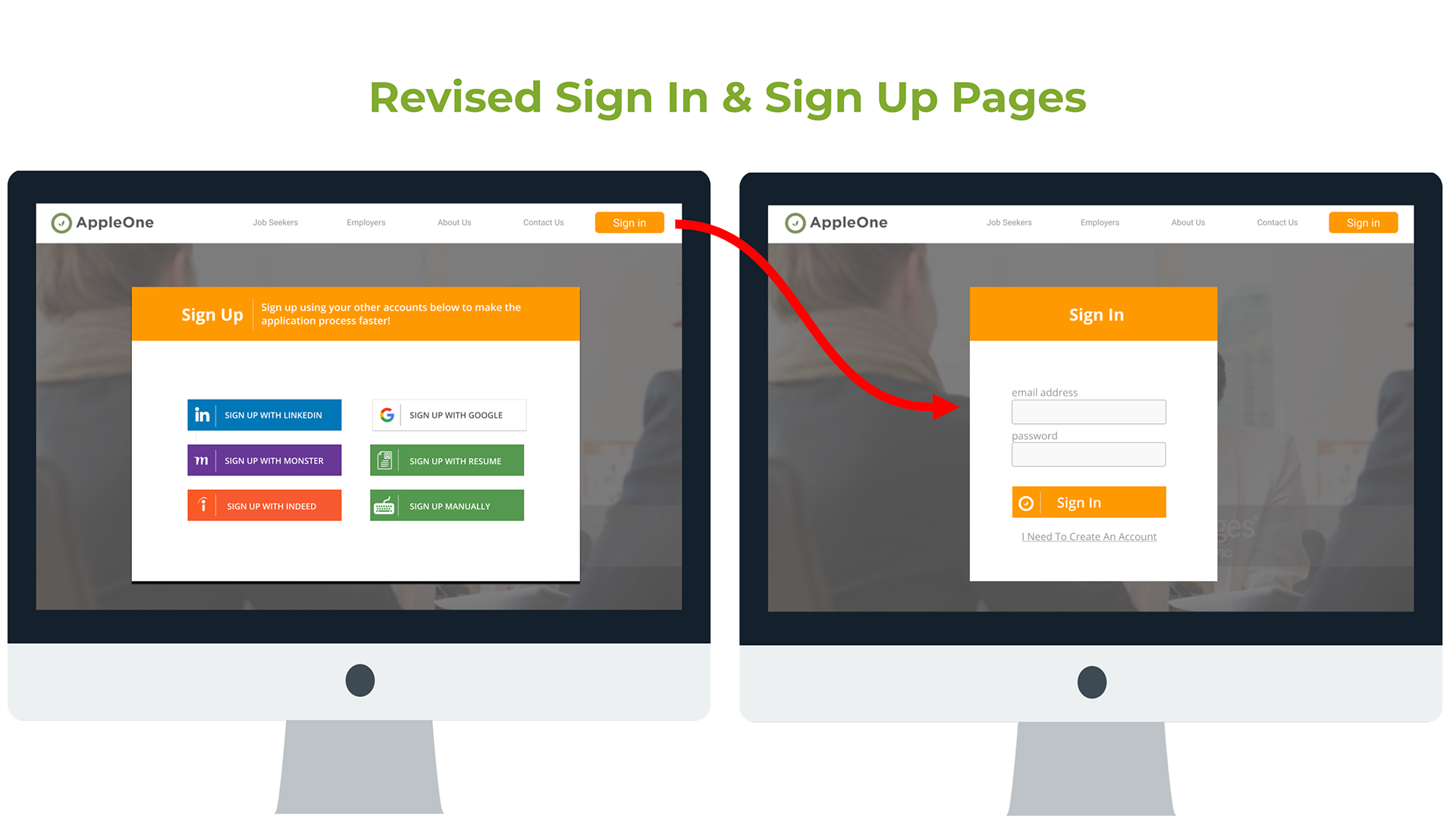
A second round of user tests were conducted with 2 other users and both completed the 5 tasks without any issues. The users felt that the mockup was simple, easy to use, intuitive, and fast.
FINAL PROTOTYPE